Flutter Widget Previews: Build Your First UI Component Without Opening the Whole App
Learn Flutter Widget Previews with a simple reminder card, official screenshots, and practical exercises for checking layouts and larger text.
Inside this guide
- What does a widget preview look like?
- Why start with one component?
- Start with a small project
- Understand the example before changing it
- Open the preview
- Give the card something awkward to display
- Build a small collection of realistic states
- What to check when something goes wrong
- Where previews fit in your workflow
- A short exercise for your next Flutter session
You change the padding on a card. Then you open the app, navigate to the right screen, and check whether it looks better.
Repeat that a few times, and a small design change starts feeling like a lot of work.
Flutter’s Widget Previewer gives you a place to focus on an individual component. You can inspect a card, button, or empty state separately from the full application. The official guide says the tool became stable in Flutter 3.47. Flutter documentation
Let’s try it with a reminder card. By the end, you will have a component you can inspect on its own, a second configuration for larger text, and a few practical checks you can repeat in your own project.
You only need a basic understanding of widgets and Dart constructors to follow along. There is no backend to configure, and the example does not require a state-management package. Keep your attention on what appears on the screen and how the code produces that result.
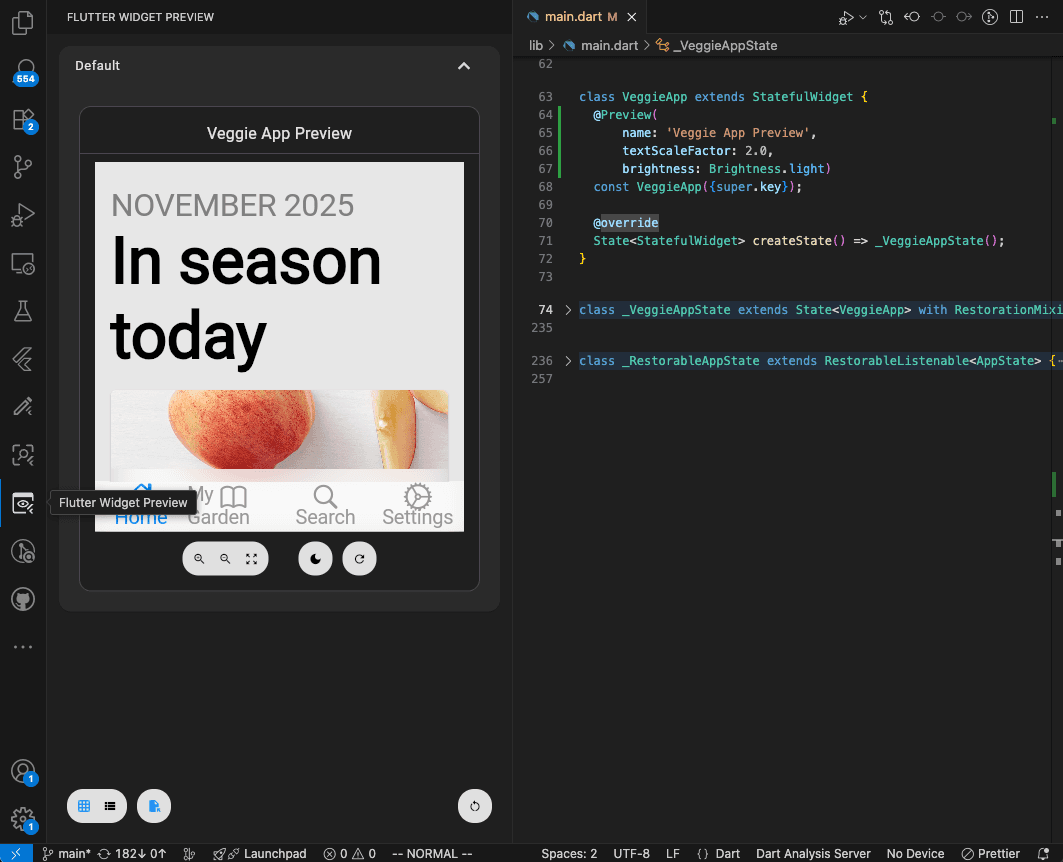
What does a widget preview look like?
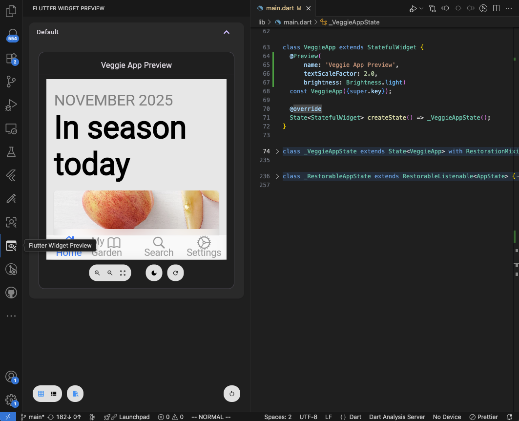
Think about a reminder screen with ten different responsibilities: loading data, handling navigation, checking permissions, displaying a list, and more.
If you only want to improve the reminder card’s spacing, those other responsibilities are distractions. A small component with sample data gives you a much simpler starting point.
Why start with one component?
When you are learning Flutter, it is tempting to build an entire screen in one long build() method. The heading, list, card, buttons, and loading message all live together. It feels convenient until you want to change one part and have to understand everything around it.
A preview encourages a useful habit: decide what information a component needs, then pass that information in. Our reminder card needs a title and a subtitle. It does not need to know where those strings came from or whether a notification has been scheduled.
Imagine two people working on the same reminder feature. One is improving the card’s appearance. The other is connecting saved reminders to the screen. A component with explicit inputs gives them a clear boundary. The visual work can begin with realistic sample values while the data work continues separately.
That same approach helps when you are working alone. You can make progress on the interface without first completing every service behind it. Later, the screen supplies real values to the same card. There is no need to maintain a second, preview-only version of the design.
For this tutorial, treat the preview as your workbench. Make a small change, inspect the result, and decide whether it improves the component. Keep the changes small enough that you can explain what happened.
Start with a small project
This walkthrough targets Flutter 3.47 or later. Check your installed SDK:
flutter --version
For a separate practice project, run:
flutter create preview_practice
cd preview_practice
Open the new project in your editor. The default starter app can remain as it is while you work on the separate card file. Keeping this exercise in a fresh project also makes it easier to tell whether a problem belongs to your example or to an existing app’s configuration.
Create lib/reminder_card.dart and add the following code:
import 'package:flutter/material.dart';
import 'package:flutter/widget_previews.dart';

class ReminderCard extends StatelessWidget {
  const ReminderCard({
    super.key,
    required this.title,
    required this.subtitle,
  });

  final String title;
  final String subtitle;

  @override
  Widget build(BuildContext context) {
    return Card(
      color: const Color(0xFFFFF1E8),
      child: Padding(
        padding: const EdgeInsets.all(20),
        child: Row(
          crossAxisAlignment: CrossAxisAlignment.start,
          children: [
            const Icon(
              Icons.notifications_active_outlined,
              color: Color(0xFFC4512D),
            ),
            const SizedBox(width: 12),
            Expanded(
              child: Column(
                mainAxisSize: MainAxisSize.min,
                crossAxisAlignment: CrossAxisAlignment.start,
                children: [
                  Text(
                    title,
                    style: const TextStyle(
                      fontSize: 18,
                      fontWeight: FontWeight.w600,
                    ),
                  ),
                  const SizedBox(height: 6),
                  Text(subtitle),
                ],
              ),
            ),
          ],
        ),
      ),
    );
  }
}

@Preview(name: 'Reminder — standard', size: Size(360, 240))
@Preview(
  name: 'Reminder — larger text',
  size: Size(360, 320),
  textScaleFactor: 1.5,
)
Widget reminderCardPreview() {
  return const Material(
    color: Colors.white,
    child: Padding(
      padding: EdgeInsets.all(16),
      child: Center(
        child: ReminderCard(
          title: 'Take a short break',
          subtitle: 'Today at 4:00 PM',
        ),
      ),
    ),
  );
}
The card accepts two strings, so its appearance does not depend on a database or notification service. Expanded gives the text the remaining row width, while the column lets the card grow vertically as text wraps.
The public, top-level reminderCardPreview() function supplies sample content. @Preview identifies it to the previewer; size supplies constraints, and textScaleFactor applies a font scale. Preview API reference
Understand the example before changing it
There are two pieces in the file: ReminderCard, which describes the component, and reminderCardPreview(), which provides one way to display it. Keep that separation in mind when you start experimenting.
The constructor requires title and subtitle. That makes missing content obvious at the place where you create the card. The sample strings sit in the preview function, so you can replace them without changing the card’s layout. In an application, those values could instead come from a reminder selected on the home screen.
Inside the card, the outer Padding gives the content breathing room. The Row places the bell and text beside each other. The horizontal SizedBox controls their separation, while the smaller vertical one separates the title from the subtitle. Each spacing value has a specific job, which makes visual adjustments easier to reason about.
Notice that the card has no fixed height. A longer title can occupy more lines, and the content can ask for additional vertical space. This is a useful starting point for text-heavy components. The surrounding preview still has finite dimensions, however, so sufficiently large content can exceed them. A flexible child does not create unlimited space in its parent.
The Material in the preview gives this example a Material surface. The fixed pale card color and white background are deliberate simplifications for the exercise. They are not a complete light-and-dark theme implementation. Before reusing this design in an app with theme switching, connect its colors and text styles to the app’s theme.
Finally, the preview dimensions describe the area available to this example. A width of 360 is a layout constraint in Flutter’s logical pixels, not a promise that you have simulated a particular phone. Device-specific checks still belong in your application testing.
Open the preview
From the project root, run:
flutter widget-preview start
The command opens a browser preview environment. Supported IDEs also expose a Flutter Widget Preview tab. Opening the previewer
Once launched, the previewer renders both @Preview annotations declared in reminder_card.dart side-by-side: "Reminder — standard" and "Reminder — larger text" (with textScaleFactor: 1.5).
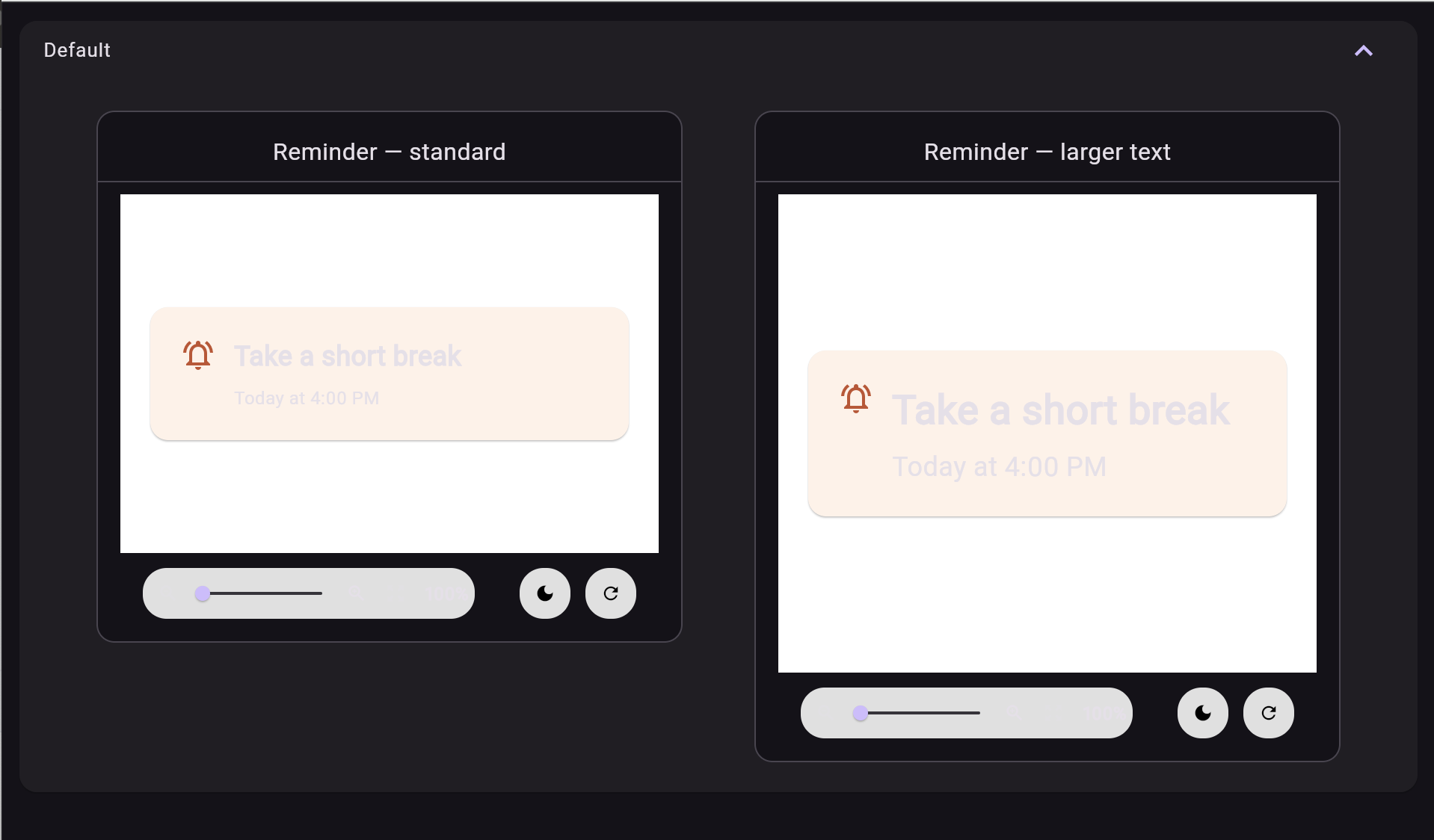
Notice how both previews instantly reflect their configured parameters: the standard card layout on the left, and the 1.5x text-scaled card on the right allowing you to inspect text wrapping, padding, and UI integrity side-by-side.
Give the card something awkward to display
A short title rarely exposes layout problems. Replace it with:
title: 'Prepare questions for tomorrow’s project review',
Now inspect both previews. Does the text fit? Does the icon still sit comfortably beside it? Is there enough space between the title and time?
Next, reduce a preview’s width to 280. Try a longer subtitle. Change the card’s internal padding from 20 to 12 and compare the result.
These small experiments teach something useful: a component has to work with content you did not design the first screenshot around.
Build a small collection of realistic states
Once the first preview works, resist the urge to create a huge gallery immediately. Start with situations that could change a design decision. For a reminder card, a short title, a long title, and larger text already cover useful ground.
Think about the subtitle too. “Today at 4:00 PM” is compact. A message such as “Every weekday after your afternoon meeting” takes more room. If the product genuinely needs that detail, the layout should accommodate it. Cutting off essential information just to preserve a tidy screenshot is a poor trade.
You can keep an additional content example in the same file. Add this public function below the first preview function. It reuses the existing ReminderCard class:
@Preview(name: 'Reminder — long content', size: Size(280, 340))
Widget longReminderCardPreview() {
  return const Material(
    color: Colors.white,
    child: Padding(
      padding: EdgeInsets.all(16),
      child: Center(
        child: ReminderCard(
          title: 'Prepare questions for tomorrow’s project review',
          subtitle: 'Every weekday after your afternoon meeting',
        ),
      ),
    ),
  );
}
Use names that explain the situation you are checking. “Long content” is more useful than “Preview 3” when you return to the project next month. A good sample should make its purpose obvious without requiring someone to inspect its code first.
You may eventually need an overdue card, a completed card, or a card with an action button. Add those examples when the actual component supports those states. For now, keep the exercise focused on content and layout. The reminder card above is presentational; it does not schedule notifications or mark a task complete.
What to check when something goes wrong
-
The preview does not appear: Start with the simplest checks: confirm you opened the intended project, saved the Dart file, and resolved any analyzer errors. Compare the preview function with the working pattern above. It is a public top-level function, requires no arguments, and returns a widget. Fix an obvious typo before changing project configuration.
-
The preview command is not recognized: Run
flutter --versionin the same terminal where you ran the command. Compare that version with the SDK selected in your editor. Different Flutter installations can make the terminal and editor behave differently. Establish which SDK each one is using before attempting an upgrade or reinstall. -
The layout overflows: Reproduce the problem with one change at a time. First restore the standard text and width. Then introduce the long title. Finally increase the text scale. This sequence helps identify whether the pressure comes from horizontal space, vertical space, or both. Do not hide the warning by shrinking all text until the example happens to fit.
-
A component expects application state: Check what it actually needs to render. If it only displays a title and a status, consider passing those values directly. If a more complex widget genuinely needs inherited state, supply a controlled preview setup with the appropriate ancestors. Avoid connecting a design exercise to production accounts or live writes.
-
A native feature fails: Separate the visible result from the platform operation. You can display a reminder’s time using sample data without asking the operating system to schedule anything. Keep the scheduling check in the running app, where the real platform implementation is available.
Where previews fit in your workflow
Hot reload remains useful when you are working inside a running application. A preview is helpful when you want to concentrate on one component and deliberately supply its visual state.
For a first project, I would start with three components: a task card, an empty-list message, and a form error. Give each realistic sample text before connecting it to live data.
The previewer uses Flutter Web. Native plugin calls and APIs from dart:io or dart:ffi are unsupported, so keep device-dependent behavior out of this exercise. Previewer limitations
For a reminder app, preview the card here, then test notification permissions, scheduling, and navigation in the actual app. Visual inspection also does not establish accessibility or automated test coverage.
A practical workflow is to finish one small component, inspect its important content variations, and then place it back into its real screen. Check the spacing between neighboring components there. A card can look comfortable in isolation and still make a list feel crowded when it appears ten times.
Also check interactions in context. If the card becomes tappable, does tapping the whole surface behave as expected? Can someone navigate back without losing their place? Does the screen handle an empty collection? These questions concern the surrounding experience, which a single static card cannot demonstrate.
A short exercise for your next Flutter session
Begin with the standard reminder card and write down one thing you want to improve. It might be the gap beside the icon or the balance between the title and subtitle. Change only that part, then inspect the standard and larger-text configurations before moving on.
Next, introduce the long-content example. If the result feels crowded, explain the cause before editing. Is the card too narrow for the intended use? Is the subtitle doing too much work? Would the real screen benefit from a different arrangement? A preview is most useful when it helps you answer a design question.
Finish by opening the actual app and checking the component in its intended location. Keep any preview that exposed a useful edge case, so the same situation remains easy to inspect after your next change.
You do not need to preview every widget on your first day. One reusable component with realistic content is enough to establish the habit. Start with a card you already understand, make its inputs explicit, and give yourself a quick way to see how it behaves when the content becomes less predictable.
Share this article
Related Articles

How to Add a Flutter Module Inside an Existing iOS App
A complete step-by-step guide to integrating a Flutter module into an existing native iOS app — covering podfile setup, route handling, and common pitfalls to avoid.
Flutter vs Native Development in 2026: How Should Businesses Choose?
A comprehensive, data-backed architectural guide comparing Flutter and Native (Swift & Kotlin) mobile development — covering cost, market share, performance, team velocity, real-world enterprise case studies, and a step-by-step decision framework.
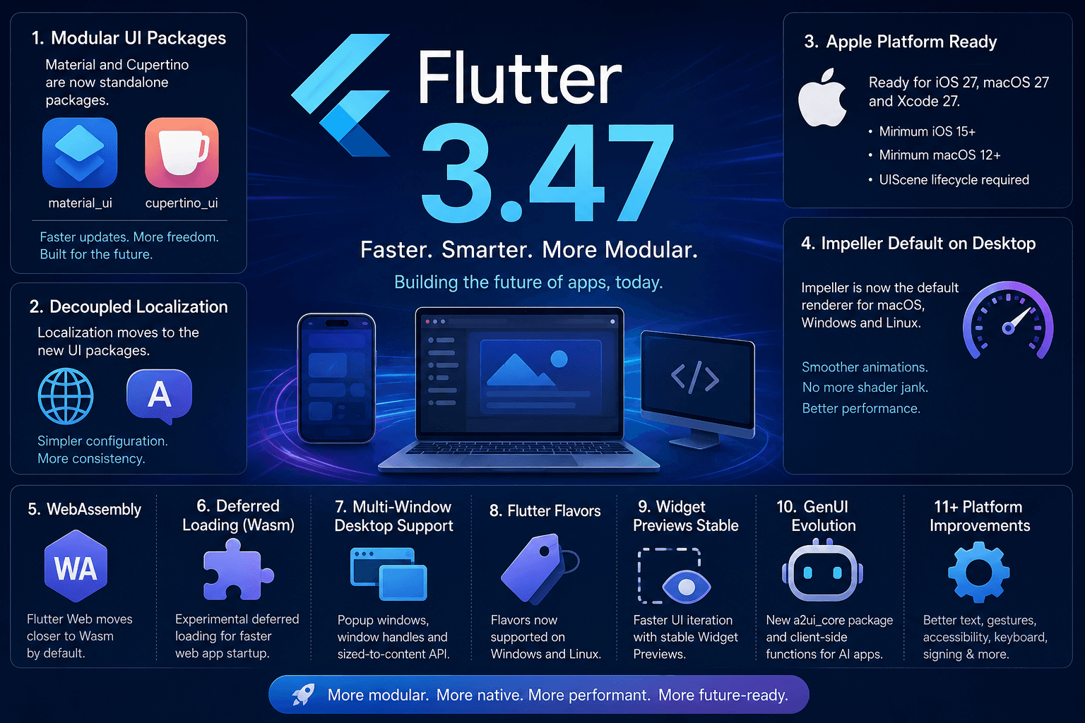
Flutter 3.47: A Major Step Toward a More Modular, Faster, and Future-Ready Framework
Flutter 3.47 introduces standalone Material and Cupertino UI packages, default Impeller renderer on desktop, mandatory UIScene for iOS 27, Wasm deferred loading, Widget Previews, and GenUI evolution.